The traditional marketing dashboard is dying. Not with a dramatic crash, but with a slow, quiet logout --- thousands of marketing teams simply stop opening the tabs they used to live in.
It is not that the data stopped mattering. It is that the delivery model broke. Dashboards were built for an era when marketers had two platforms to check and one report to build. That era is over.
In 2026, the teams winning at paid media are not the ones with the best dashboards. They are the ones who never need to open a dashboard at all.
Welcome to the age of push analytics.
The Rise and Fall of the Dashboard Era
Dashboards had a good run. For nearly fifteen years, they were the answer to every data question in marketing. Need to see campaign performance? Build a dashboard. Want cross-channel visibility? Build another dashboard. Client wants weekly numbers? Build a dashboard and send them a login.
The logic made sense in 2012. Data was scarce, and having it aggregated in one visual layer was a genuine competitive advantage. Looker, Tableau, Data Studio, and dozens of purpose-built marketing dashboards gave teams a window into their ad accounts that platform-native reporting could not match.
But the world moved on, and the dashboard model did not.
The number of ad platforms the average brand manages has tripled. The volume of campaigns running at any given time has exploded with broad targeting and creative testing frameworks. And the number of people on a marketing team who need access to performance data has grown from one media buyer to an entire cross-functional squad spanning creative, growth, finance, and leadership.
Dashboards were not designed for this. They were designed for one person to pull up one screen and make sense of a manageable set of numbers. That is no longer how marketing teams operate.
Dashboard Fatigue is Real
If you manage paid media in 2026, you know the feeling. You open your laptop in the morning and face a wall of tabs: Meta Ads Manager, Google Ads, your analytics platform, your attribution tool, your BI dashboard, your reporting tool, and the three spreadsheets your team uses to track creative tests.
Each one demands a login. Each one has a slightly different data model. Each one requires you to remember which filters were set, which date range matters, and which metric definition is being used.
This is dashboard fatigue, and it is one of the biggest silent productivity killers in performance marketing today.
The symptoms are predictable:
- Too many tools, too few insights. Teams pay for five or six dashboarding products but still cannot answer basic questions like "which creative drove the most revenue last week" without a twenty-minute investigation.
- Context switching destroys focus. Every time a marketer switches from campaign optimization to a reporting dashboard, they lose momentum. Research suggests context switching can cost up to 40% of productive time.
- Data goes stale between visits. A dashboard only works if someone looks at it. If your team checks in once a day --- or worse, once a week --- problems like runaway spend or creative fatigue go undetected for far too long.
- Insight hoarding by default. Dashboards are pull-based, meaning only the people who actively log in and navigate to the right view get the insight. Everyone else on the team operates on outdated information or secondhand summaries.
- Alert fatigue from bolt-on notifications. Some dashboards have added email alerts, but these are typically noisy, poorly formatted, and disconnected from the team's actual workflow.
The fundamental problem is architectural. Dashboards are "pull" systems. They sit there passively, waiting for a human to come find the answer. In a world where the pace of change in ad accounts is measured in hours, not weeks, that model is structurally inadequate.
What Push Analytics Actually Means
Push analytics flips the model entirely. Instead of requiring a human to navigate to a dashboard and search for insights, a push analytics system delivers the insights proactively --- to the channels where the team already works, on a schedule that matches the cadence of their decision-making.
There is no login. There is no tab. There is no context switch. The insight arrives in Slack, in an email, or in whatever communication layer the team lives in, formatted and ready for action.
This is not just "alerts." Alerts are a subset of push analytics, and usually a poorly implemented one. True push analytics encompasses:
- Scheduled performance digests. Daily or weekly summaries of campaign, ad set, and creative performance delivered automatically at the time your team needs them.
- Ranked creative reports. Top-performing ads sorted by the metrics that matter to your team --- ROAS, CPA, revenue, engagement --- delivered without anyone running a query.
- Budget and spend alerts. Proactive notifications when campaigns overspend, underspend, or deviate from pacing targets, surfaced before they become costly problems.
- Landing page and funnel breakdowns. ROAS by landing page or product category, delivered so media buyers know where to allocate budget before they even open the ad platform.
- Scale and optimization recommendations. Data-driven signals identifying which campaigns are ready to scale and which need creative refreshes, pushed to the team rather than buried in a dashboard tab.
The key distinction is initiative. Push analytics does not wait. It acts on a schedule, evaluates the data, and delivers what matters. The human's job shifts from data retrieval to data interpretation --- which is where the actual value lives.
Pull Analytics vs Push Analytics
Understanding the structural difference between these two approaches is critical for any marketing ops leader evaluating their analytics stack.
| Characteristic | Pull Analytics (Dashboards) | Push Analytics (Proactive Delivery) | |---|---|---| | Delivery model | User navigates to a tool and searches for data | Insights are delivered to the user automatically | | Primary interface | Browser-based dashboard with filters and charts | Slack, email, or messaging platforms | | Who sees the data | Only people who actively log in | Everyone on the team, automatically | | Timeliness | Depends on when someone checks | Delivered on a defined schedule or triggered by events | | Context switching | High --- requires leaving current workflow | None --- arrives in the existing workflow | | Insight discovery | User must know what to look for | System surfaces what matters based on rules and patterns | | Setup effort | Often requires dashboard building, filter configuration, and ongoing maintenance | Configure once, receive ongoing automated reports | | Failure mode | Nobody logs in, data goes unseen | Insight arrives but team does not act on it | | Best for | Deep ad-hoc exploration and investigation | Ongoing monitoring, team-wide visibility, and rapid response |
Neither model is universally better. Pull analytics still has a role for deep-dive investigation --- the kind of exploratory analysis where you need to pivot tables, change dimensions, and drill into anomalies interactively.
But for the 80% of analytics needs that are recurring, predictable, and team-wide, push analytics is objectively superior. It eliminates the single biggest failure mode of dashboards: the assumption that someone will remember to look.
The Slack-Native Reporting Revolution
The rise of push analytics is inseparable from the rise of Slack (and similar platforms) as the operating system of the modern marketing team.
Slack is where decisions happen. It is where media buyers flag problems, where creative directors share new concepts, where leadership asks for weekend performance numbers, and where agencies update their clients. It is the ambient layer of the organization.
Delivering analytics into Slack is not a gimmick. It is a recognition that insights are only valuable if they reach the right person at the right time in the right context. A beautifully designed dashboard that nobody opens is worth less than a plain-text Slack message that arrives at 8 AM with yesterday's top three ads ranked by ROAS.
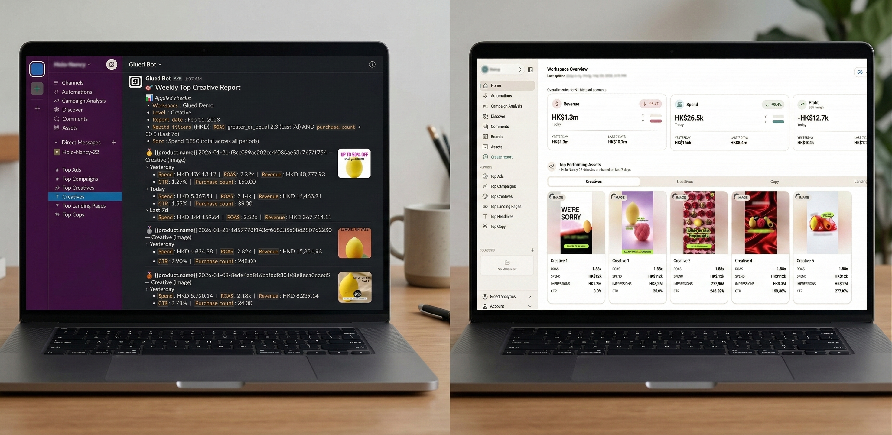
This is the approach that platforms like Glued have built around from the ground up. Rather than building yet another dashboard and bolting on Slack notifications as an afterthought, Glued treats Slack as the primary delivery layer. Campaign digests, top ads rankings, budget alerts, landing page breakdowns, and scale recommendations all flow directly into the Slack channels where the team operates.
The result is a fundamentally different workflow. Instead of a media buyer starting their day by logging into four tools, they start by reading a Slack digest that already contains the performance summary, the anomalies flagged, and the recommended actions. Their first click is on the ad platform to act on an insight, not to search for one.
What a Push-First Analytics Stack Looks Like
If you are building or rebuilding your marketing analytics stack in 2026, here is what a push-first architecture looks like in practice:
- Data connectors pull from ad platforms on a schedule. Meta, Google Ads, TikTok, and other platforms feed data into a centralized system automatically. No manual exports, no CSV downloads.
- Automated report generation runs on a cadence. Daily campaign digests compile overnight. Weekly summaries roll up on Monday morning. Custom reports fire on whatever schedule the team defines.
- Delivery goes to Slack, email, or both. Reports arrive in dedicated channels --- one per workspace, one per client, or whatever structure matches the team's organization. Everyone who needs the data gets it without asking.
- Alerts fire on threshold breaches. Budget pacing deviations, spend anomalies, creative fatigue signals, and performance drops trigger immediate notifications so the team can respond in hours, not days.
- Dashboards exist as a secondary layer. For deep-dive investigation and ad-hoc questions, a visual interface is still available. But it is the exception, not the default. The dashboard is the scalpel, not the daily meal.
- Workspace-level isolation keeps things clean. Each brand, client, or business unit gets its own workspace with its own schedules, channels, and report configurations. No cross-contamination.
This is not a theoretical stack. This is how teams using Glued operate today --- with push-based delivery as the default and dashboards reserved for the moments when you genuinely need to explore.
Making the Transition from Dashboards to Push Analytics
Shifting from a pull-based to a push-based analytics model does not require ripping out your entire stack overnight. The transition works best as a deliberate, phased migration.
Step 1: Audit Your Dashboard Usage
Before changing anything, figure out what is actually being used. Most teams will discover that the majority of their dashboards have single-digit weekly active users --- or zero. Identify which reports are genuinely accessed on a recurring basis and which exist purely because someone built them once.
Step 2: Identify Your Recurring Reports
The best candidates for push analytics are the reports your team pulls on a predictable cadence. Daily performance checks. Weekly client summaries. Monthly budget reviews. If someone is manually generating the same report every week, that is a push analytics opportunity.
Step 3: Define Your Channels and Cadences
Map out where each report should land. Which Slack channel? Which team members? At what time and frequency? This is the configuration layer that replaces the "remember to log in" layer.
Step 4: Start with One Workflow
Pick the highest-frequency, highest-pain reporting workflow and automate it first. For most teams, this is the daily campaign performance digest. Get it flowing into Slack, let the team live with it for two weeks, and iterate on the format and metrics based on feedback.
Step 5: Expand and Retire
Once the team trusts the push-based delivery for daily digests, extend to weekly summaries, creative rankings, budget alerts, and landing page breakdowns. As each push report proves reliable, retire the corresponding dashboard view. You will be surprised how quickly people stop missing it.
Step 6: Reserve Dashboards for Exploration
Keep your dashboard tools for genuine ad-hoc analysis --- the kind of question that only comes up once a month and requires interactive slicing. But make push analytics the default for everything recurring. The 80/20 rule applies: 80% of your analytics value should be delivered proactively.
The Future Belongs to Teams That Let Insights Come to Them
The dashboard era taught us something important: centralizing data creates visibility. But it also created a dependency on human initiative that does not scale.
Push analytics is not a rejection of data-driven marketing. It is the logical evolution. It takes the same data, the same metrics, and the same insights, and removes the bottleneck of requiring a human to go find them.
The teams that will outperform in 2026 and beyond are the ones that design their analytics stack around delivery, not around dashboards. They will catch budget problems in hours instead of days. They will spot creative fatigue before ROAS craters. They will keep their entire team --- from media buyers to CMOs --- operating on the same numbers without anyone needing to log into anything.
The dashboard is not dead yet. But it is no longer the center of gravity.
Glued is built around push-first analytics for paid media teams. Automated campaign digests, creative rankings, budget alerts, and landing page breakdowns delivered directly to your Slack --- on the schedule you define. If your team is tired of logging into dashboards to find the numbers that should have come to them, see how Glued works.